Introduction toThe Grid Method
Before you dive into drawing every tiny detail of a bicycle or a teacup, let’s take a step back and make a game plan. Great drawings don’t start with perfect lines — they start with simple shapes and smart thinking!
In this lesson, you’ll learn how to see objects as building blocks: circles, squares, triangles and more. We’ll start by gently sketching those shapes to map out where everything goes — loose and light, like a whisper on the page.
Only once things are looking just right will we go in with confident lines to bring the drawing to life. Think of it like building a sandcastle: first, you plan the towers, then shape the mounds, and only then do you carve out the cool bits.
You may not need to erase anything but it’s good to have an eraser to hand just in case you change your mind about parts of your drawing. I like to get scribbly when drawing my initial outlines, which inevitably means erasing all my planning lines at some point as I neaten and refine my work.
![]()
You may not need to erase anything but it’s good to have an eraser to hand just in case you change your mind about parts of your drawing. I like to get scribbly when drawing my initial outlines, which inevitably means erasing all my planning lines at some point as I neaten and refine my work.
![]()
You will need something to draw on, so find yourself a sheet of cartridge paper, approximately 140gsm is perfect but so long as you’re not using printer paper you will be OK.
![]()
You’ll need a ruler to outline your boxes, but not for the cross-hatching. Measuring your shapes with a ruler can also be useful when trying to keep objects like vases looking symmetrical.
![]()
How does cross-hatching create tone?
Before you start to draw an object, look at it really closely and try to work out which areas are the lightest (the highlights), the darkest (the shadows) and all the different shades inbetween (the midtones).
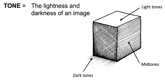
Once you understand the role of light in your drawings you can use cross-hatching to add tone, which will make it look more 3D.
Famous artists who have used cross-hatching
Artists like Leonardo da Vinci, Vincent van Gogh, Rembrandt van Rijn, and Giorgio Morandi all used cross-hatching in their sketches.
Cross-hatching exercise:
Step-by-step:

To begin with, practise your cross-hatching in a series of boxes, varying the number of intersecting lines you use to make change how light or dark your boxes are.
- Draw 6-8 boxes in pencil that are all the same size, using your ruler to keep them straight.
- You can leave the first box empty. That’s all you have to do for the lightest parts of your drawings!
- In the next box, neatly draw some diagonal lines that are all the same distance apart. You don’t need a ruler for these lines because you want your cross-hatching to look more sketched than that.
- In the following box, add another set of lines that go in a different direction. Having two sets of lines will make the box appear a bit darker.
- Continue to add cross-hatching to the remaining boxes, using more and more lines that get closer and closer together so that each box is darker than the last.
Once you’ve done the steps above you should have a nice stepped gradient, well done!
Have a go at creating another cross-hatched gradient, but this time you only need to draw one long rectangular box.
Try to create a gradient just like before, only this time you want it to transition from light to dark as seamlessly as you can, without any sudden changes.
Once you’ve got to grips with your shading gradients using cross-hatching, have a go at drawing a cross-hatched vase (or similar object).
- Lightly draw a line down the centre of your page. You will use this as a line of symmetry to help keep your drawing looking straight.
- Start with your initial outlines, using your ruler to check the left of your vase is the same distance from your line of symmetry on both the left and the right.
- Make sure the bottom of your vase is rounded.
- At the top of your vase draw an ellipse (like a narrow oval), rather than a circle.
Extra tip: if you draw contour lines on your vase you’ll find it easier to know where to cross-hatch
Add cross-hatching to your vase using a black fine-liner pen, just like you did on your practice gradient. The difference this time is that your gradients will follow the contours of the vase.
To keep it simple, draw a vase that is lighter towards the centre and darker towards the outside, then put a linear gradient on the ellipse at the top to create a shadow.
Top tips:
- Press lightly with your initial pencil lines
- Plan and measure your outlines carefully to make your symmetrical
- Draw by hand, without a ruler, when adding cross-hatching
- Vary your tones to make it look rounded and 3D
- Consider the direction of the light
The finished drawing:

Examples by other students:
What do you think has gone well and how might they be improved?
More examples of cross-hatching: